CASE
STUDY 04


I led the rebrand of a dance company, redefining their visual identity to better reflect the precision, energy, and professionalism of their work. The project spanned logo design, motion assets, and a full redevelopment of their showreel creating a cohesive brand system designed to perform consistently across digital, social, and live content.
APPROACH
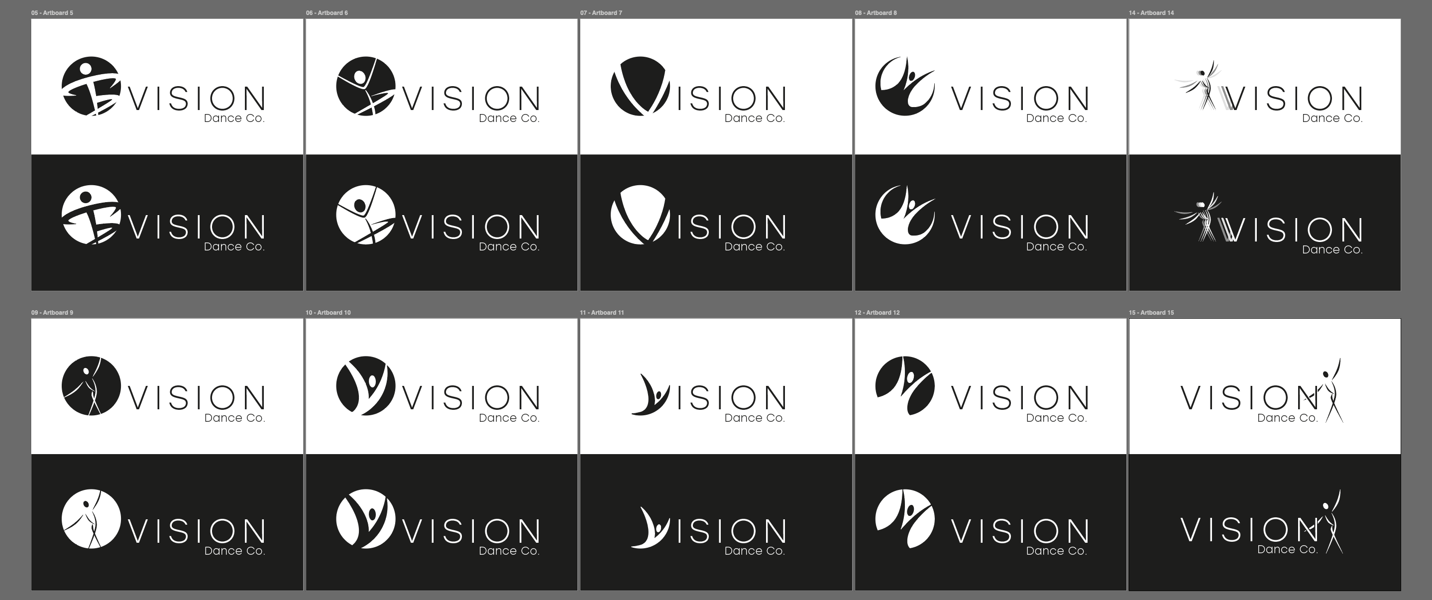
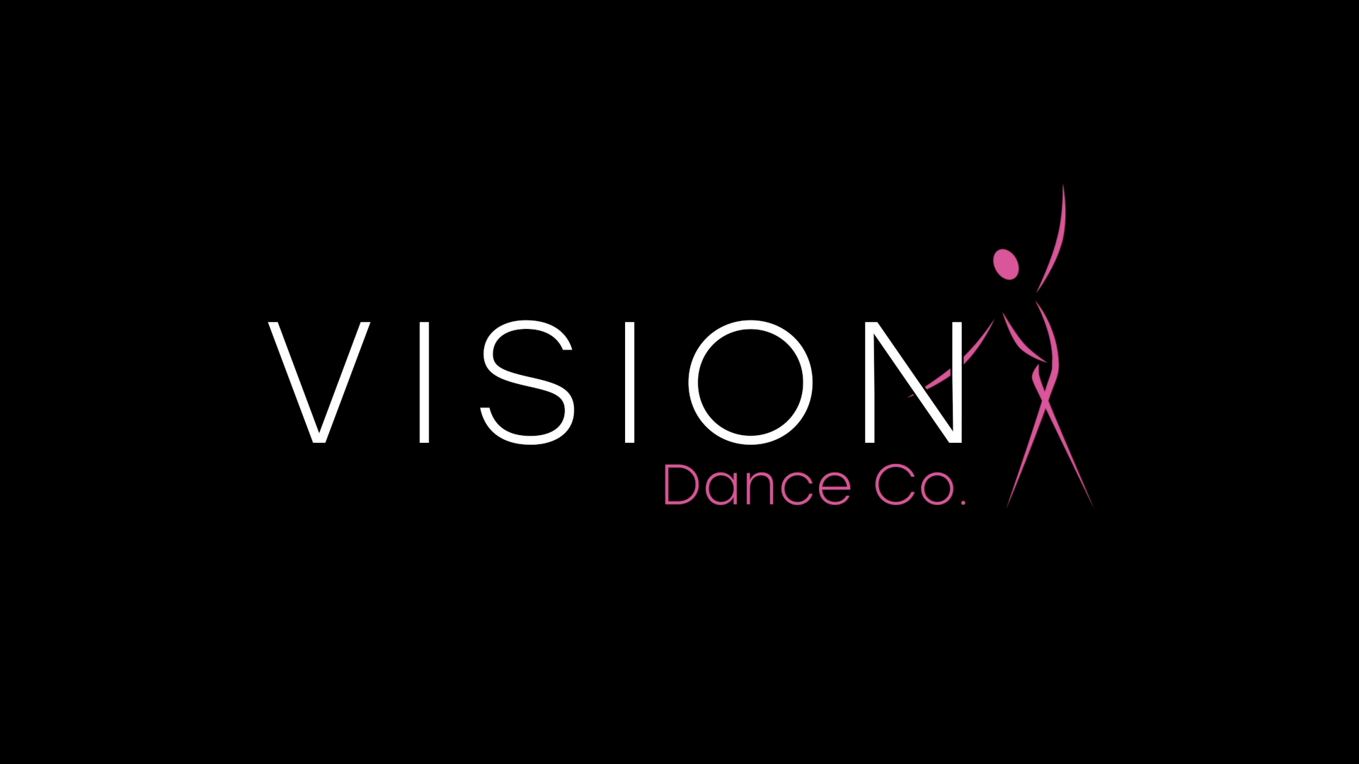
The brief called for a clean, modern, and elevated identity. I approached this by developing a range of refined logo directions, each exploring the balance between typographic clarity and expressive form. The selected route combined a minimal text with a fluid, abstract figure drawn using continuous, lightweight strokes to capture motion, elegance, and control. The intention was to create a mark that felt premium and restrained, while still embodying the dynamism of performance. The contrast between structured type and organic form became the foundation of the brand language.
DESIGN & EXECUTION
I built a flexible logo system designed for adaptability across platforms, including multiple lockups and responsive formats. The identity
was developed with motion as a core consideration, ensuring it translated seamlessly into animation. Using After Effects, I created a suite
of animated assets that brought the brand to life through subtle, controlled movement focusing on timing, easing, and flow to reflect the
physicality of dance.
In parallel, I reimagined their showreel from the ground up. Updating their 2019 version, I introduced a cleaner visual framework aligned
to the new identity, while pushing pacing, rhythm, and editorial structure to better showcase the energy and variety of performances. The
film builds with intent, culminating in the animated logo as a clear and confident brand sign-off.
OUTCOME
The result is a refined, contemporary identity system that positions the company at a higher professional standard while remaining expressive and performance-led. The brand now operates cohesively across static and motion touch points, with animation playing a key role in its application.
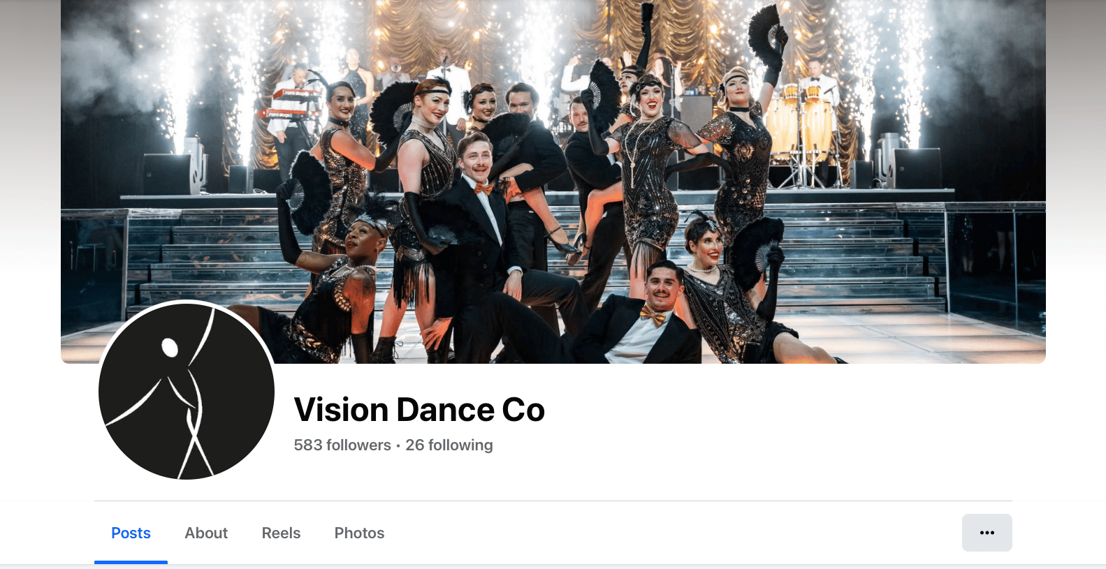
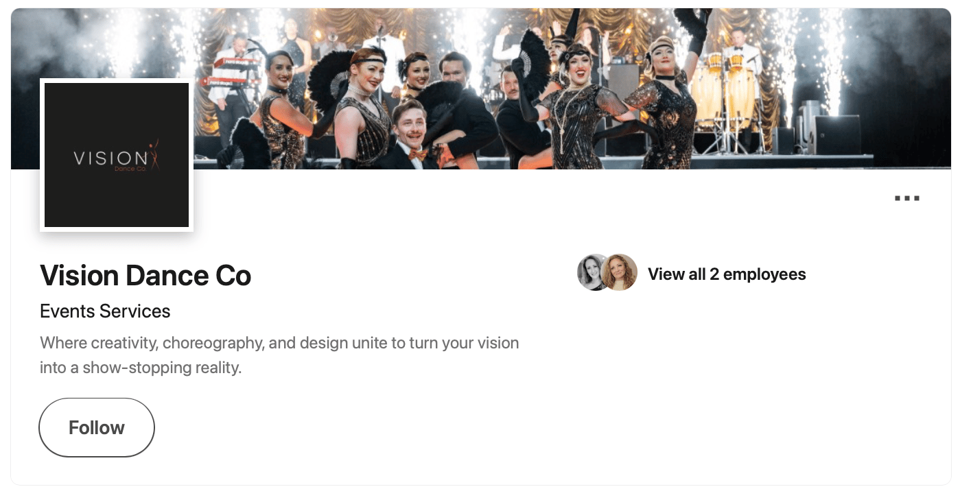
The new showreel delivers a stronger, more impactful representation of their work, balancing clarity with energy, and has become a central asset in their promotion. The rebrand was very well received, with the client fully adopting the identity across all platforms and consistently utilising the motion assets to reinforce brand presence.
HOME
HOME
About
About
PORTFOLIO
PORTFOLIO
Hire Me
Hire Me
CASE
STUDY 04
I led the rebrand of a dance company, redefining their visual identity to better reflect the precision, energy, and professionalism of their work. The project spanned logo design, motion assets, and a full redevelopment of their showreel creating a cohesive brand system designed to perform consistently across digital, social, and live content.
APPROACH
The brief called for a clean, modern, and elevated identity. I approached this by developing a range of refined logo directions, each exploring the balance between typographic clarity and expressive form. The selected route combined a minimal text with a fluid, abstract figure drawn using continuous, lightweight strokes to capture motion, elegance, and control. The intention was to create a mark that felt premium and restrained, while still embodying the dynamism of performance. The contrast between structured type and organic form became the foundation of the brand language.
DESIGN & EXECUTION
I built a flexible logo system designed for adaptability across platforms, including multiple lockups and responsive formats. The identity
was developed with motion as a core consideration, ensuring it translated seamlessly into animation. Using After Effects, I created a suite
of animated assets that brought the brand to life through subtle, controlled movement focusing on timing, easing, and flow to reflect the
physicality of dance.
In parallel, I reimagined their showreel from the ground up. Updating their 2019 version, I introduced a cleaner visual framework aligned
to the new identity, while pushing pacing, rhythm, and editorial structure to better showcase the energy and variety of performances. The
film builds with intent, culminating in the animated logo as a clear and confident brand sign-off.
OUTCOME
The result is a refined, contemporary identity system that positions the company at a higher professional standard while remaining expressive and performance-led. The brand now operates cohesively across static and motion touch points, with animation playing a key role in its application.
The new showreel delivers a stronger, more impactful representation of their work, balancing clarity with energy, and has become a central asset in their promotion. The rebrand was very well received, with the client fully adopting the identity across all platforms and consistently utilising the motion assets to reinforce brand presence.